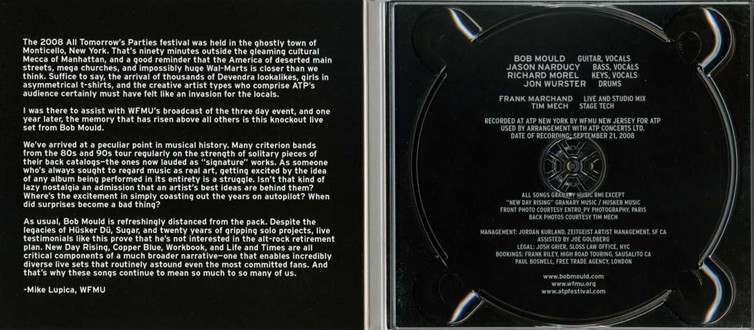
A digipak is an essential part of creating a musician's image as it helps determine who would buy the product and what the band/artist represent in terms of their music. It is a modern approcach to CD packaging and often looks similar to this:
For our band, our brand image is alternative/indie rock and that needs to be conveyed on the digipak, so I researched into different bands simialar to what we want to portray and it was clear that they did not focus on the band members the images used were slightly obscure and usually related to the title of the album, such as 'Science and Faith' by The Script
It is important that on the front of the Digipak there needs to be the name of the artist in large clear font, which is evident in The Script's album cover; the font needs to be the same throughout the digipak to keep it cleaner and easy to read for the buyer. Additionally, the font reflects the type of music produced and also becomes a recognisable symbol of the artist, for example Metallica are a band that produce metal music and that is why they chose to have this particular font in each of their digipaks:


On the back of a digipak
there needs to be a promotional sticker to help draw attention to the recent tours or special features in the album, production information regarding the copyright, the year of production, web address, record label and the band/artist's logo. It also NEEDS a list of the tracks within the album. The colour scheme is VERY IMPORTANT and needs to echo throughout the digipak in the same way the font does. Overall, it should only use a maximum of three colours and must create a visual link with the way the band wishes to be advertised.
The inside of a digipak is where the band/artist usually place their acknowledgements to those who have helped or inspired their work and another list of the tracks with more specific detail indicating who is playing what instrument in what song.
The advertisement for the band/artist needs to reflect the same colour scheme, font and graphic design as the rest of the digipak but it must include these essential details reffering to the band:
- release date
- artist name and album title
- image of digipak
- tour dates
- review quotes from magazines and newspapers
- record label logo and website


No comments:
Post a Comment