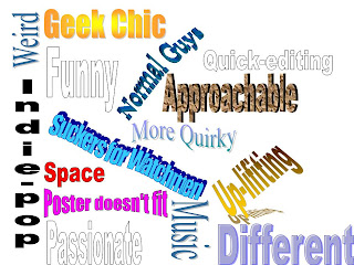
In order to gain a full grasp of a wider reaction from an audience we had an audience feedback forum where the group of AS students ageing between 16 and 17 watched the video again and were able to give us critical feedback on it as to what they personally thought of it. However, because they were all from the same age range and social background with the majority of them with a British nationality it limited our focus group and meant that we were getting responses from people all relatively similar and interested in like-minded things. Yet, having said this because there was a mixture of gender (although there were only a couple boys) we were able to see the different views that the seperate sexes carried; an example being that girls felt more inclined to watch the video again than the boys and this we figured was because of the humour and innocence that was being portrayed on the screen that is appealable to girls and less appealing to boys. We also handed out the posters and digipaks to see whether they thought the image provided on the posters were the same as what the band was portraying in the music video. Previously to the forum I looked at the comments made on the Youtube page where are video is. However, one of the key problems as to having it on YouTube is that unless one searches for the video specifically it will be hard for them to find, especially considering that the song is not that well known; the majority of comments were positive feedback on the editing. Nevertheless, comments on the internet can only give certain feedback to a certain extent and that was why we felt that organising a forum where we were able to personally ask the audience what they thought and what they felt did not work. One comment was that the poster was "too black" and reminded him of "a heavy metal band" rather than a quirky boy band. However, having said that some of the girls understood our meaning behind the darker colours of the posters with the yellow writing because as one said that it connects to "the black behind the members with the yellow writing on the drummer's t-shirt: LOL". The silhouettes and blackness also created a different interpretation of what we intended as they felt that it was "too rock" in comparison to the video. They also felt that the name was good but the other songs on the back of the CD cover did not connect with the name of the track used in the video, 'Baby Loves Me'.
One of the main problems that was discovered after doing the feedback forum was that the digipak, tour poster and band poster did not match with that of the image the band were presenting in the video and advice from the feedback was that we should have "included more humour" into the posters. A significant problem with it was the fact that it was too dark and so the audience were confused as to what genre of band it was representing indicating an oppositional reading to what we were hoping. However, when asking the question: "would you watch it again?" the majority of the class said that they would not because they felt that the video was slightly repetitive and once you had seen it you had seen it all which could have been a cause of the fact that there was a lack of narrative and continuously the same shots are shown. Although, those that said they would watch it again is because they liked watching the band as a band and having fun together, this links to Lazarfeld, Brumler and Katz's theory of uses and gratifications and how the audience feel a personal relationship with the band members. A member in the forum said that "the group of boys look like fun guys that would be easy to get on with" indicating the bond that was created from the video; they identified with the band on a personal level as in a similar way to other groups such as Spice Girls and Take That, there are individual characteristics between the group that the audience are able to recognise. All of this information suggests that the personal relationship Additionally, having the humour meant that audience members were given a DIVERSION from regular life and everyday pressures because "it was just so weird." It was good having the audience forum of a similar age group to what we expected the target audience to be because we could understand whether or not it would appeal to them and from the discussion it was clear that most of the people enjoyed watching the video and found it amusing but would probably not go to see the band in a concert.
Here is a screen grab of a detailed analysis of who exactly is watching our video, which I found available on YouTube:
From it, we can understand that the video is mainly watched in the United Kingdom by older males and teenage girls. It was interesting to know exactly how people found the video because I can imagine if you were not looking for it, then it would be much harder. However, one thing I think helped largely with the viewing audience was the fact that I put it onto my Facebook wall, where my friends in different countries had the ability to watch it and spread the viewing. We have had 300 views in over a month and from these statisitics it is clear that our expectations of the majority of people watching the video would be young adults was proven wrong, as it is clear that a lot of men aged between 55 and 65 also watch our video, which I found particularly interesting.


